Experiments / Research
Word’s only “No Brand” brand has the most powerful branding ever built
June 1, 2026
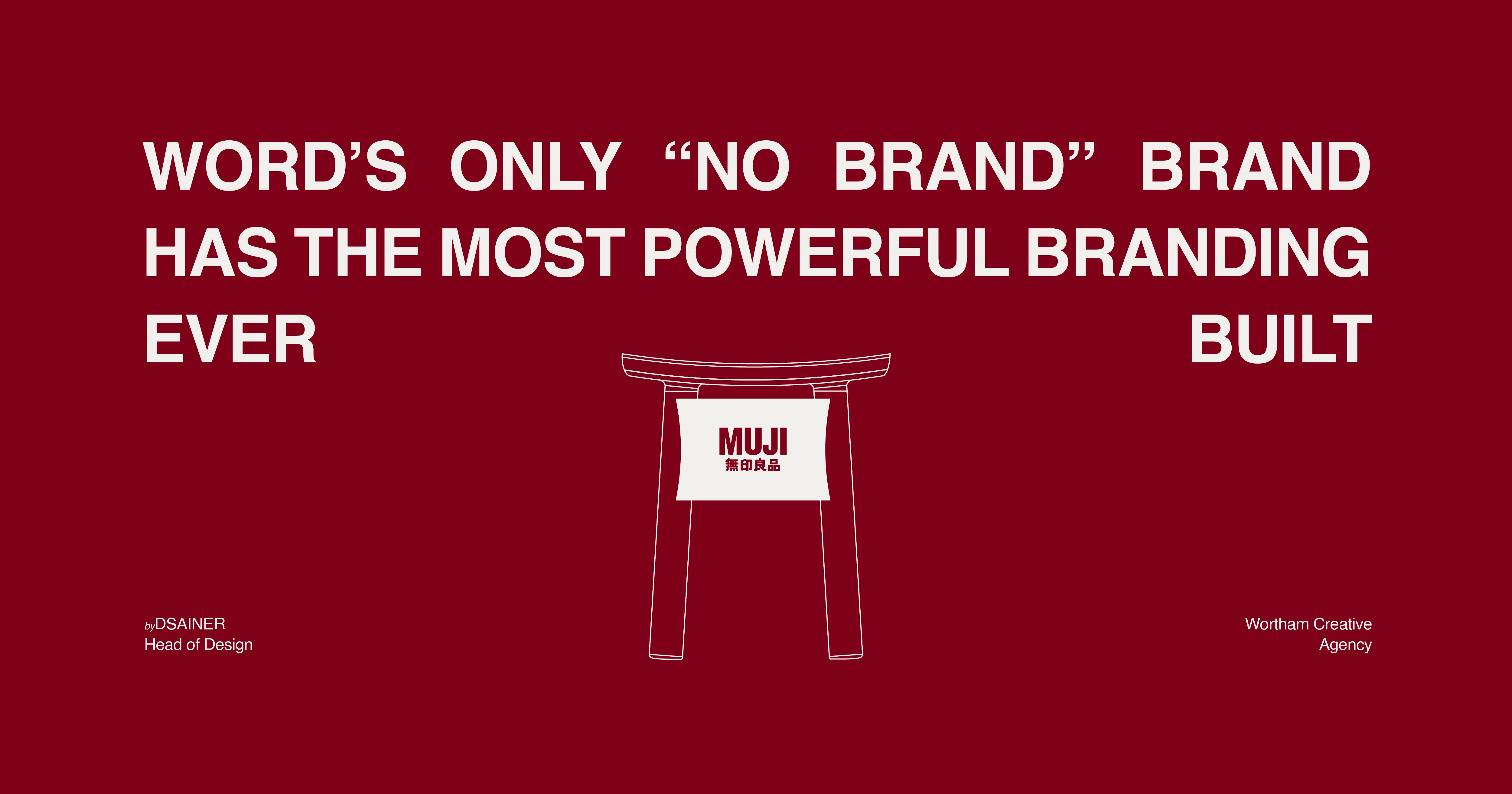
Everyone Says MUJI Has No Brand. I Say They Are Looking in the Wrong Place.
MUJI has one of the most powerful, disciplined brand systems ever built — designed by a man who understood that true branding is never seen. It is only ever felt.
By [DSAINER] · Head of Design, Wortham Creative Agency
Let me start with something that happened the first time I walked into a MUJI store.
I wasn't there professionally. I wasn't studying the brand, benchmarking the space, or analysing the retail experience. I just walked in. And something happened that I couldn't immediately explain — the noise in my head went quiet. I slowed down. I started noticing things. Not because anything was demanding my attention. But because nothing was.
That experience stayed with me. And the more I thought about it as a designer, the more I realized: what I felt in that store was branding. Not the kind you see on a screen or a billboard — the kind you feel in your body. The kind that works on you before you know it's working.
That is what I want to talk about. Because I am tired of hearing that MUJI has no brand. That is not just wrong — it fundamentally misunderstands what branding can be.
First — meet the man who built the vision
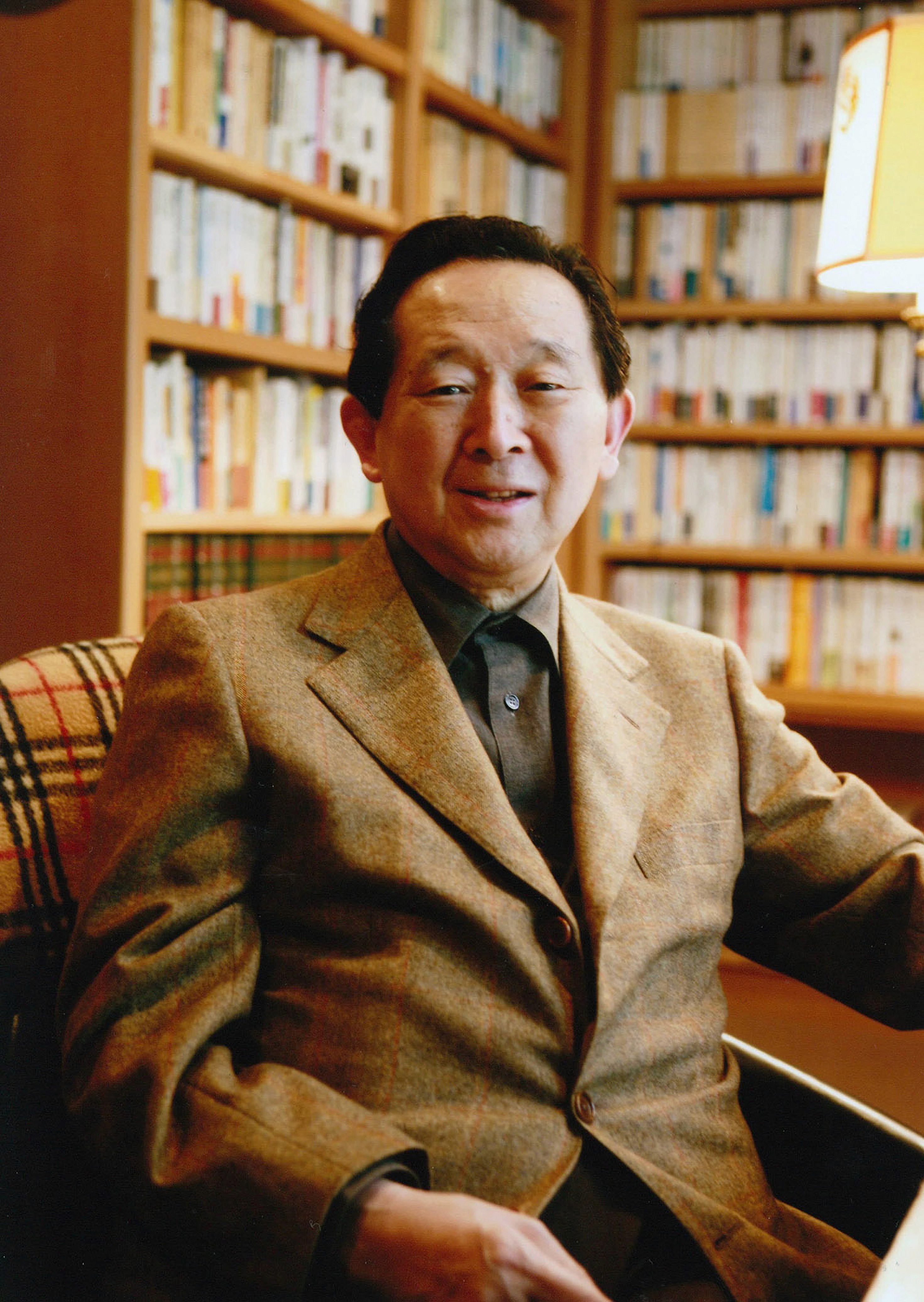
Seiji Tsutsumi was born in Tokyo in March 1927. After graduating from the University of Tokyo, he built one of Japan's most powerful retail empires — the Saison Group — which included Seibu Department Stores, Family Mart, and Ryohin Keikaku, the company that owns MUJI.
In 1979, Tsutsumi brought together managers, designers, and writers to brainstorm on creating a private brand. Japan at the time was in an economic boom — and brands were competing on spectacle, logo, and inflated price. It had become standard to sell products at a price much higher than their actual quality by slapping the logo of a famous brand on them. At MUJI, the thinking was that this was an improper application of added value.
Tsutsumi's instinct was simple and radical at the same time: strip everything back. Remove the logo. Remove the excess packaging. Remove the inflated price. And let the quality of the product speak for itself.
MUJI launched in 1980 with only 40 products — marketed at a lower price but with high quality, with the slogan "Lower priced for a reason." In 1981, Tsutsumi proposed opening a dedicated shop for MUJI products. Although rejected initially, the advisory board eventually supported the idea. The rest is history.
My thought as a designer: What Tsutsumi did was not just create a product line. He created a counter-argument to an entire market. In a world of noise, he chose silence. In a world of logos, he chose restraint. That decision — made in 1979 in a brainstorming room — is still paying dividends 45 years later. That is what it means to build from conviction, not trend.
Then — meet the man who executed it
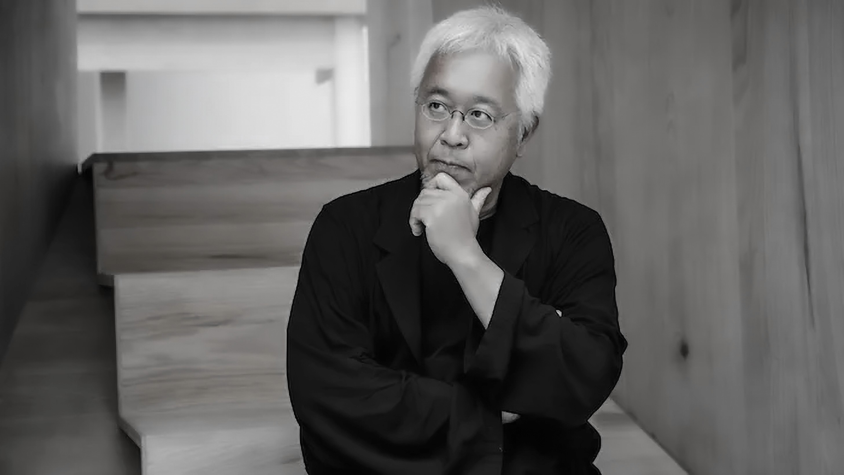
You cannot talk about MUJI's brand without talking about Kenya Hara. He has been MUJI's art director since 2001 — considered the most influential designer in present-day Japan — and the philosophy he brought to the brand is unlike anything else in modern retail.
He didn't come to MUJI with a visual identity system. He came with a philosophy. And that philosophy has one word at its centre: emptiness.
"Design's intention shouldn't be obvious — it should be a suitable thing prepared for people without them noticing it." — Kenya Hara
The aesthetic of emptiness — the historically evolved Japanese concept of simplicity — is at the heart of Hara's thinking. But emptiness here does not mean bare or cold or cheap. It means something far more precise.
Hara compares good design to an "empty container" — a vessel whose meaning is not fixed, not limited. A MUJI product is designed to belong to anyone, anywhere, in any context — because it has been deliberately emptied of a specific personality. When you remove the product's ego, you make room for the user's life. The product fits everywhere because it insists on nothing. That is not a limitation. That is the highest form of design intelligence.
In his book White, Hara describes white not just as a color but as a symbol of potential: white is a condition ready to be filled — a fertile space of possibility where imagination can begin. This philosophy comes through in everything MUJI makes.
The white space is not emptiness for its own sake — it is a deliberate invitation. It says: there is room for you here. That is a brand promise more powerful than any slogan.
My thought as a designer: This is the part most designers and founders miss. Hara didn't build a visual system. He built a belief system. And that belief system is so deeply embedded in every product, every store, every material choice — that it doesn't need a logo to communicate itself. The philosophy IS the identity.
MUJI's branding exists in everything you feel — not everything you see
Here is the exact argument I make when a client tells me MUJI has no brand identity.
I ask them: have you ever used a MUJI product? Almost always, the answer is yes. And then I ask: could you tell it was MUJI — without seeing a logo? Also yes.
That recognition — that feeling — is branding. It just lives in a different place than you're trained to look for it. Most brand education teaches you to find branding through visibility: the logo, the color, the campaign, the tagline. So when you encounter MUJI — a brand that strips all of that back — you make a critical mistake. You assume there is no branding at all.
There is. It's just working on a different frequency entirely.
Here is exactly where it lives:
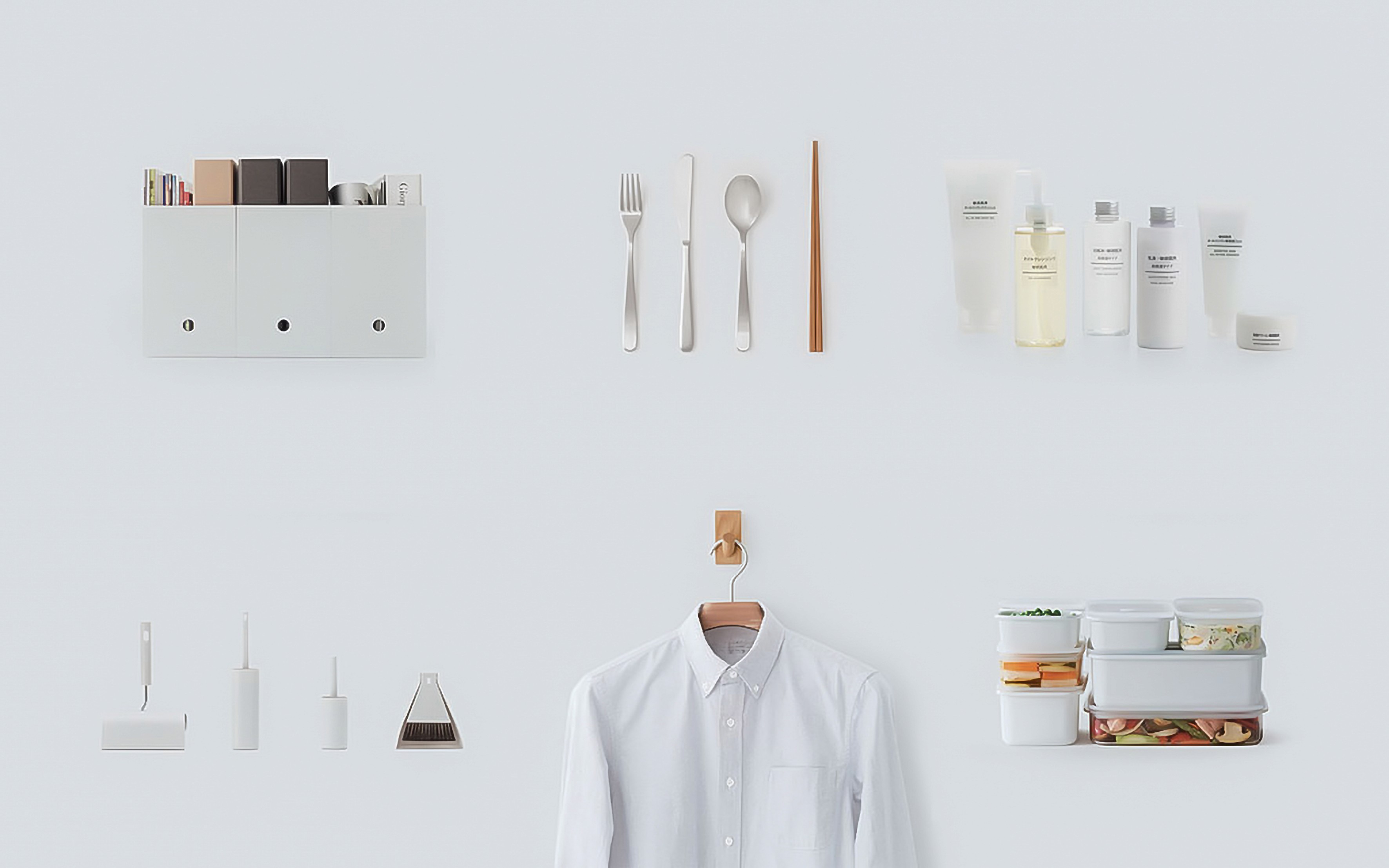
Product design → Simple. Functional. No excess. Every detail serves the object's purpose — nothing added for show, nothing removed for cost-cutting. The product is exactly what it needs to be, and nothing more.
Color palette → Neutral, earthy, calming. A palette that belongs everywhere and imposes itself nowhere. It doesn't assert a mood — it accommodates yours.
Packaging → Transparent, minimal, often unbranded on the product itself. Kraft paper. A plain label that tells you exactly what's inside — and absolutely nothing else. The restraint is the message.
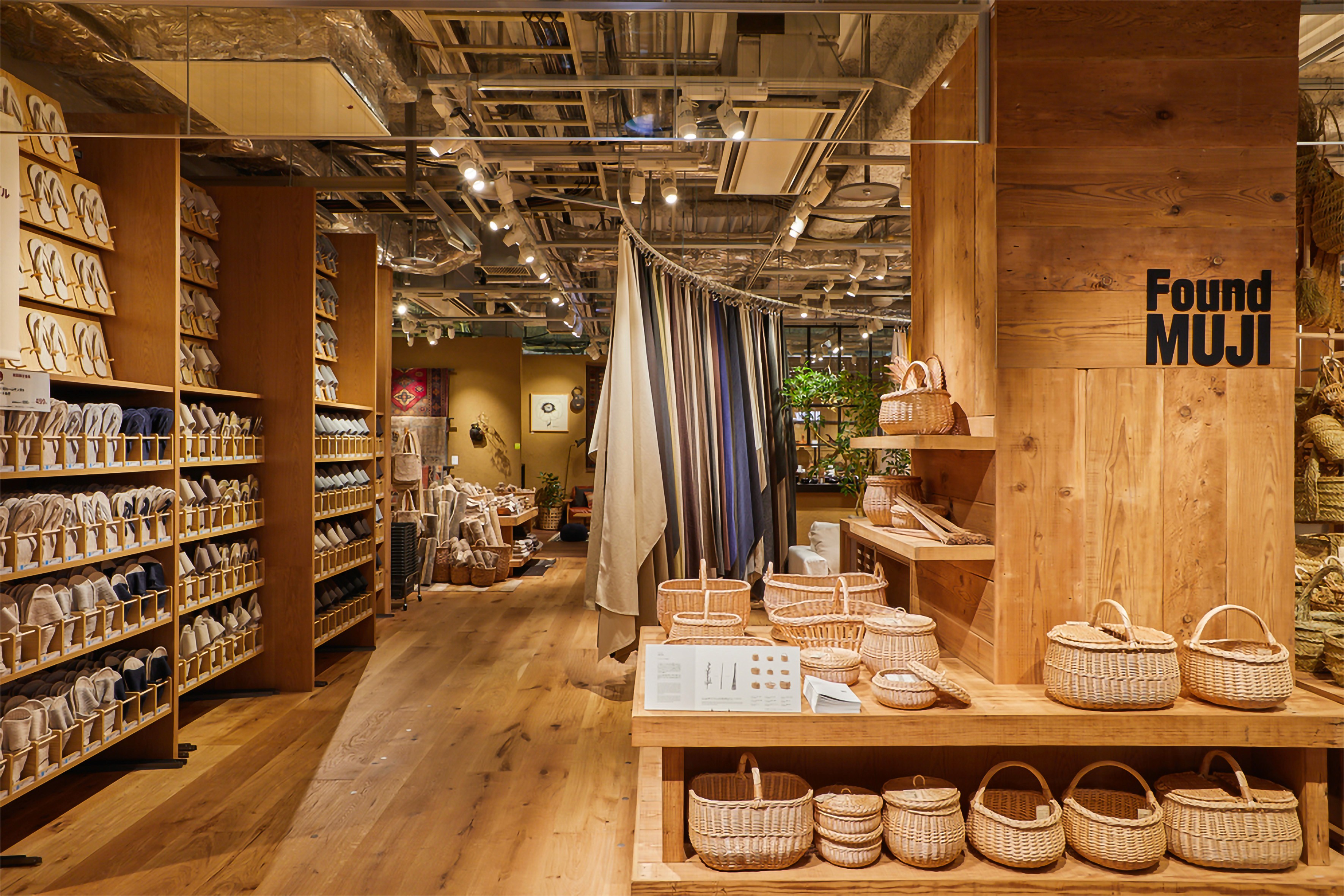
Store experience → Quiet, spacious, almost meditative. Wide aisles. Natural light. Products placed with intention. No music fighting for your mood. The space itself is the brand — made physical, made inhabitable, made breathable.
Philosophy → "No-brand quality goods." Four words that became a worldview — one that has never needed to be updated, refreshed, or replaced in 45 years.
These five elements are not aesthetic choices. They are a system. A set of rules governing every single decision the brand makes — consistently, across 1,400+ stores, in 30+ countries, over 45 years. That is not "no branding." That is one of the most rigorous branding systems in the world.
What I personally noticed in the store
When I first walked into a MUJI store, the big bold letters — M·U·J·I — were right there at the entrance. Clean, confident, unmistakable. But step inside? The logo disappears. It greets you once. It doesn't follow you around.
The products carry no logo. The packaging carries no logo. But everything — the material, the proportion, the color, the silence of the space — tells you exactly where you are. That confidence is not silence. It is a declaration. It says: we don't need to keep reminding you who we are. You already know.
MUJI uses its logo in outdoor ads, on billboards, in campaigns — but the tagline stays constant everywhere: "no-brand quality goods." The ad tells you who they are. The product doesn't need to.
And here is the thing that hit me hardest: MUJI is totally anti to how every other brand operates — and it is winning. Every other brand puts the logo on the product. MUJI removed it. Every other brand refreshes the identity every few years. MUJI hasn't changed the philosophy in 45 years. Every other brand engineers excitement in its stores. MUJI engineers calm.
My thought as a designer: Calm, it turns out, is one of the rarest and most valuable feelings a brand can give someone today. That's not a design choice. That is a brand strategy of the highest order.
The paradox that changes everything
Here is the argument I save for last — because it is the one that stops people mid-sentence in a client meeting.
MUJI is the world's most recognizable "no-brand" brand.
They named themselves after the absence of branding. They built their entire identity on having no identity. And it worked so completely that you can identify a MUJI product without a single logo on it — purely from the system, the material, the form.
People say: "MUJI has no brand identity. It's just plain products. There's nothing to recognize."
The truth: MUJI is one of the most instantly recognizable brands in the world — and its recognition comes entirely from the system, not the symbol.
That is the most important lesson MUJI teaches me — and the one I repeat most in our studio at Wortham Creative. The system is always stronger than the symbol. If people can recognize your brand without seeing your logo, you have built something real. Something that lives in the product and the experience and the feeling — not just in the mark.
MUJI proved that a brand can be completely anti to market conventions and still win.
1,412 stores. $4.4 billion. 45 years.
Logo never on the product.
That is not a coincidence. That is a system working exactly as designed.
MUJI's branding exists in everything you feel — not everything you see. That's why most people miss it. And that's exactly why it works.
BUT you say, there are other brands too, who did similar positioning like Muji.
1. The Ordinary: The "Radical Transparency" Anti-Brand
If MUJI’s strategy is rooted in the philosophy of "emptiness," The Ordinary’s strategy is rooted in "clinical reality."

Before The Ordinary, the beauty industry relied entirely on lifestyle branding—selling the promise of youth or luxury through abstract names (e.g., "Advanced Night Repair") and premium price points. The Ordinary stripped the ego and the poetry out of the product entirely.
The Strategy: Replace marketing fluff with raw ingredients. A product isn't called "Miracle Glow"; it is called "Niacinamide 10% + Zinc 1%."
The Visual System: Clinical, apothecary-style dropper bottles with rigid, unembellished typography that prioritizes information hierarchy over aesthetics.
Why it works like MUJI: Like MUJI, The Ordinary demands a certain level of intelligence from the consumer. MUJI invites the user to fill the "empty" space with their own lifestyle; The Ordinary invites the user to educate themselves on cosmetic chemistry. Both brands remove the traditional "salesman" from the packaging, allowing the rigid consistency of their design systems to do the heavy lifting.
2. Brandless: The "Literal Commodification" Anti-Brand
Launched in 2017, Brandless took the "no-brand" concept entirely literally. They sold household staples in uniform, brightly colored packaging with white boxes stating exactly what was inside (e.g., "Organic Virgin Coconut Oil"), originally pricing everything at exactly $3.
The Strategy: The premise was fighting the "BrandTax"—the idea that consumers pay a premium just for a logo.
The Flaw: Brandless fundamentally misunderstood what makes an anti-brand successful. They thought removing the logo was enough. But while MUJI spent decades engineering an exacting standard of aesthetic restraint and material quality, Brandless simply created generic commodities.
The Result: The original company ultimately shut down and pivoted. When you strip away the brand identity but fail to replace it with a compelling belief system or a superior standard of product design, you aren't an anti-brand. You are just a generic store brand.
Seven Lessons from the World's Most
Disciplined Brand
What MUJI taught me about design, restraint, consistency — and why I now teach these to every designer and founder I work with.
I've been studying MUJI for years. Not from the outside — from the inside of the work. As a designer, as someone who briefs teams, presents to founders, and argues for restraint in rooms where everyone wants to add more. And what I keep returning to is this: MUJI is the clearest argument I know for what design actually is.
Not decoration. Not trend. Not a logo on a product. Design is a system of decisions — made consistently, over time, from a place of conviction. These are the seven lessons I take from MUJI. The ones I teach my team at Wortham Creative. The ones I repeat in every founder conversation. Written here, plainly, for anyone who makes things and wants them to last.
Lesson one · For every designer
Clarity is the brief.
Not decoration.
MUJI started with 40 products and one question: what does this thing need to be, and nothing more? That's not a design brief — that's a philosophy. Most briefs I receive go the other direction. Layers of wants stacked on top of needs. Trends on top of function. Aspiration on top of reality.
Before we touch a single pixel at Wortham Creative, I ask clients to strip the brief to its core. What problem are we actually solving? Who, specifically, are we solving it for? What is the one thing we want someone to feel, do, or remember? Everything else is decoration. And decoration is expensive, hard to maintain, and easy to get wrong.
"The most important design question is not: what should we add? It is: what is this thing actually for?"
Ask your client this
If your brand disappeared tomorrow, what would your customers actually miss — the logo, or the experience? That answer tells you exactly where to invest your design energy.
My thought as a designer
Most founders come to us wanting a brand that "stands out." MUJI stands out by doing less than everyone else. Clarity is not a starting point you rush through to get to the interesting stuff. Clarity IS the interesting stuff. When you find it, everything else becomes obvious.
Lesson two · For every founder
Consistency beats creativity.
Every single time.
MUJI has maintained the same visual and philosophical identity for 45 years. No seasonal rebrands. No trend chasing. No logo refresh to "stay relevant." That discipline is almost uncomfortable to witness — and it is precisely why the brand is worth billions today.
I see agencies — including good ones — convince clients to rebrand every 3 to 4 years because the work "feels dated." Sometimes that's true. More often, it's because we underestimate how long it takes for an identity to truly land in people's minds. Brand recognition is a compounding asset. Every time you reset it, you pay the full price again — from zero.
What most brands do
Rebrand every few years. Chase trends. Change when growth stalls. Keep starting over and wonder why nothing sticks.
What MUJI does
Repeat the same philosophy with more confidence each year. Let time compound the identity. Never blink. Never apologize for it.
The cost nobody talks about
Rebranding doesn't just cost design fees. It costs every year of familiarity you've already built with your audience. Consistency, held long enough, becomes its own competitive moat — one that money alone cannot buy.
Lesson three · For every designer
The designer's ego is
the enemy of the work.
MUJI asks its designers to leave no visible signature. No clever flourish. No "this is clearly designed" moment. The goal is to produce something that feels inevitable — as if it could not have been any other way. That requires enormous skill and zero ego.
Most of us were trained to leave a mark. Portfolios reward distinctiveness. Awards celebrate the recognizable. But the most valuable design work often disappears completely into the experience. It removes friction so thoroughly that users never notice it existed. The best interface you have ever used — you probably cannot describe it. That invisibility is the standard.
"The goal is not to create something that looks designed. The goal is to create something that looks right."
My thought as a designer
I have to remind myself of this constantly. The urge to make something that shows the craft — that signals effort — is real and it is wrong. MUJI's products don't show their craft. They deliver it. There's a profound difference between those two things. The showing is for the designer. The delivering is for the person who lives with it.
Lesson four · For every designer
Subtraction is a skill.
Teach it like one.
Design education teaches addition. Here's a problem — add a component, add a feature, add a visual element. MUJI's entire practice is built on the opposite question: what can we remove without diminishing the thing? And crucially — does removing it actually improve it?
I spend more time teaching my team to subtract than to create. It's harder. Addition feels productive. Subtraction feels like risk. But every unnecessary element on a page, every extra word in a headline, every color that wasn't earned — these are costs paid silently by the user in attention, in confusion, in cognitive load. MUJI taught me to see those costs as clearly as I see the work itself.
Audit everything
Of each element, ask: if we removed this, would anyone miss it?
Cut one more thing
After every review, remove one element you were unsure about.
Respect the silence
White space isn't empty. It's where the important things breathe.
Studio rule at Wortham Creative
Before any presentation, every designer on the team asks: what would happen if we removed this? If the answer is "nothing changes" — it gets cut. No arguments. No exceptions.
Lesson five · For every founder
Price on value, not on flash.
The product is the proof.
MUJI occupies a position most brands are afraid to hold: not cheap, not luxury. Priced on the honest value of the thing itself. No brand premium inflating the number. No false modesty undercutting it. Just: this is what it costs to make something this good, this carefully. That's it.
As an agency, this is the conversation I have with every new client. We don't price our work on how impressive the output looks in a presentation. We price it on the strategic clarity it delivers, on the compounding value of a well-built identity, and on the real cost to a business of getting this wrong. That is a harder conversation. It is also the right one.
For your next pricing conversation
Don't lead with deliverables. Lead with outcomes. MUJI doesn't sell you a pen — it sells you the quiet confidence of something that works exactly as it should, every day, for years. That's a different value proposition entirely.
My thought as a designer
Founders often undercharge because they think the market wants cheap. MUJI charges honestly for quality and the market responds with loyalty. The brands that compete only on price are racing to the bottom. The brands that compete on honest value are building something that lasts.
Lesson six · For founders and designers
Sustainability is not a campaign.
It is a foundation.
MUJI was reducing packaging, using recycled materials, and eliminating production waste before "sustainability" became a marketing category. It wasn't a campaign layer or a brand story. It was structural — baked into every decision from material selection to production process to how spaghetti offcuts got sold instead of thrown away.
Clients increasingly want to add sustainability as a brand badge. A campaign. A section on the website. A line in the mission statement. I push back on this every time. Sustainability that lives only in the communication layer is fragile, increasingly unconvincing, and the first thing audiences see through. When it's embedded in how you actually operate — people can see it. You don't need to say it because the product says it for you.
"Don't claim what you haven't built into the work. The product always tells the truth — even when the marketing doesn't."
Lesson seven · For every founder
Slow growth, held firmly,
beats fast growth scattered.
MUJI took nine years to become an independent company. Eleven years to open its first international store. Forty-five years to reach 1,412 locations globally. That is not a slow brand — that is a patient one. Every single expansion was done with the same philosophical care as the first 40 products. Nothing was rushed because nothing needed to be rushed.
In agency life we talk constantly about scaling. Scaling output. Scaling teams. Scaling revenue. MUJI asks a different question entirely: are you ready to do this new thing with the same care you did the first thing? If the answer is no — you are not ready to scale yet. That standard, held consistently, is what turns a brand into an institution.
The question I ask my team every quarter
Are we growing faster than our standards? Because the moment growth outpaces craft, you stop being MUJI and start being everyone else. And everyone else is easy to forget.
My thought as a founder and designer
The pressure to grow fast is real — from investors, from the market, from your own ambition. But MUJI's 45-year arc is proof that the slowest, most disciplined path is often the one that arrives somewhere worth being. $4.4 billion. 1,412 stores. Built one careful decision at a time.
MUJI is not a perfect company. No company is. But as a design philosophy, it is one of the clearest arguments I know for the power of conviction — conviction about what to make, how to make it, what to charge, and what to leave out.
The brands we admire most — the ones that last, the ones that actually mean something — are almost always the ones that decided early what they would never do. And then held that line. That decision is design. Everything else is just execution.
Next time a client asks you to make it louder — ask them first if they have ever walked into a MUJI store and felt exactly what they needed to feel, without being asked once.
"Every brand wants to be big. Very few are willing to be consistent. But consistency, held with discipline across years — that is not just a brand strategy. That is a legacy."
You don't build an iconic brand in a campaign. You build it in the thousand quiet decisions nobody sees — until one day, everyone does.
— DSAINER, Head of Design, Wortham Creative Inc.
Wortham is a brand strategy and creative agency. We help brands find the conviction at the centre of their identity and build institutions around it — from India to the world.


